#Industry News
A Dialogue between Textures. Smooth and Oxidized Brass for the Interior
The design of PLANIUM has studied the chromatic contrasts between the oxidations of copper and the copper itself and is now dedicated to the same principle regarding brass.
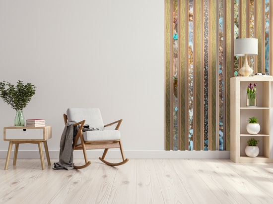
Planium works on metals and proposes suggestions for interior design based on the alternation of colors of the same material, with the combination of smooth and oxidized brass.
Our visual culture can exploit the dichotomy of “contrast” to create its own harmony and virtuous pattern. Let us see it in the example of the metallic textures of Planium to decorate with floors and walls. In the brand, the variety of brass, copper and various types of steel give life to different collections: Charme, Silver and Eclipse. To these were added the MAVI and MAVI Calypso for oxidized metal plates and tapestries which help to form surprising scenarios.
The Oxidation of Brass. How to Alternate it with Smooth Brass
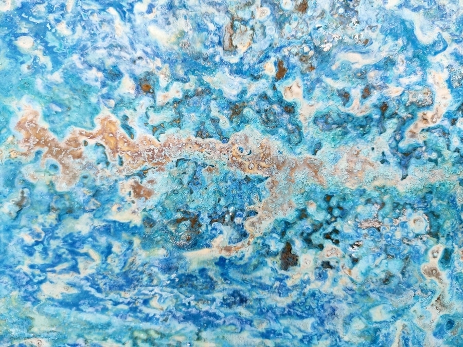
Cerulean, Turquoise, Ultramarine Blue and other colors in this range are the protagonists of the oxidation of brass, and more. The ocher color expands with marked references to the colors of the seabed and seaweed, contexts which seem to involuntarily inspire them. The shades of a yellow linked chromatically to the earth - curry yellow, greyish beige, brown beige - increasingly tending towards green (lime, olive) meet the blue backgrounds. In this case, cladding using brushed brass and its oxidized textures means offering a hot-cold chromatic swing with a prevailing domination of light, bright, iridescent colors that closely remind us of the spring and summer seasons. It is possible, however, by specifically choosing the textures closest to cold colors, to turn towards those shades of lime green which are more "transversal" and opaque and offer a different scenography.


