#Industry News
How to choose the color of the resin floor for your industrial environment, commercial and residential
Selecting the most suitable resin floor colour for an industrial environment involves careful consideration of aesthetics, visibility, and employee well-being.
Researchers and experts have made some important discoveries about the psychology of colour and the effect it has on moods, feelings, and behaviours. Colours are linked to emotions since they can stimulate our endocrine system, influencing mood and our physiological reactions.
Colour psychology is used as a tool by interior designers since it is crucial to think about the type of atmosphere you want to create and what colours will help achieve the goal. That's why, to improve the moods of both workers and customers, for a correct design of workspaces we cannot avoid applying the results deriving from studies on colour psychology.
The confirmation that colour causes a reaction in the brain that can influence the moods of workers and their productivity has in fact encouraged architects and interior designers to study solutions that favour one colour over another to improve efficiency depending on the activities to be carried out in the environment in question.
Psychological properties of blue colour:
1. Positive: intelligence, confidence, efficiency, serenity, duty, logic, reflection, calm
2. Negative: coldness, detachment, lack of emotions
Blue is a colour with calming properties, has the power to stimulate clear, logical, and effective communication, promotes concentration and manages to dissolve mental tension. However, if used in excess, it can create a cold, non-emotional and hostile environment. Blue should be preferred in high-traffic office areas due to its beneficial relaxing effect, but it is also useful in environments that must express trust, it is no coincidence that several banking institutions have adopted blue as the dominant colour for the interiors of their offices, pursuing the goal of appearing as a reliable resource.
Psychological properties of red colour:
1. Positive: courage, strength, warmth, energy, excitement
2. Negative: challenge, aggression, tension
Red is a powerful, exciting colour and has the characteristic of attracting attention. It stimulates and increases our heart rate, teases liveliness, and makes the environment friendly. If well dosed, it has the power to increase the flow of energy, becoming an excellent colour to be used in the workplace where employees need to be stimulated, especially in areas dedicated to marketing. Often associated with authority and power it becomes perfect, if used sparingly, even in executive and presidential offices.
Psychological properties of yellow colour:
1. Positives: optimism, confidence, extraversion, emotional strength, friendliness, creativity
2. Negative: irrationality, anxiety
The colour yellow is stimulating and has the power to incite optimism and confidence. It should be wisely dosed when combined with strong and aggressive colours such as red to prevent it from giving rise to too exciting environments. Yellow is useful in offices dedicated to creativity and teamwork because it can inspire employees to come up with new and innovative ideas. Combined with neutral colours, the less bright shades of yellow are ideal for creating environments that need tranquillity.
Psychological properties of the colour Green:
1. Positive: harmony, balance, refreshment, rest, reassurance, balance, peace
2. Negative: boredom, stagnation
Green is the colour of balance and harmony. Restful and reassuring, the green shades are an excellent choice in offices that require people to work long hours but also in spaces where you want to relieve anxiety and make users feel more welcomed and relaxed, such as in doctors' offices.
Psychological properties of the colour Purple:
1. Positives: containment, luxury, authenticity, truth, quality
2. Negative: introversion, inferiority
Purple is an elegant colour that has the power to encourage deep contemplation and meditation. However, its excessive use can lead to too much introspection and can arouse distrust in people. Indicated in offices where precision work must be carried out, evoking luxury, it is the right choice even in representative spaces.
Psychological properties of the color Orange:
1. Positives: comfort, warmth, safety, passion, abundance, fun
2. Negative: deprivation, frustration, immaturity
Orange is a stimulating colour both physically and emotionally. Associated with food and heat, it is a natural choice if used in areas reserved for break and refreshment areas, but being also a fun colour, it becomes a valid option also for offices dedicated to young workers where you want to privilege face-to-face conversations and seek mental stimulation. Used with black, it leads the mind to feelings of deprivation and its excessive use suggests frivolity and lack of serious intellectual values. When combined with white, on the other hand, it evokes a cheerful response in people and can help to liven up dark or dimly lit spaces.
Here's a practical guide to help companies make informed decisions:
1. Assess the environment and functional requirements:
- Consider the type of industrial environment (e.g., manufacturing, logistics, electronics) and the specific activities conducted in the area.
- Evaluate the level of foot and vehicle traffic, potential for spills, and exposure to chemicals or abrasive materials.
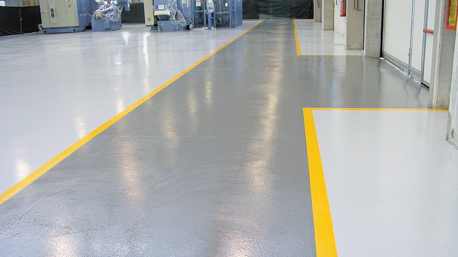
- Identify any safety requirements, such as color-coding specific zones or walkways for visual guidance.
2. Opt for neutral or light colours:
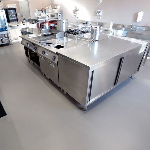
- Neutral or light-coloured resin floors are generally recommended for industrial environments. They provide a clean and professional appearance, making it easier to detect spills, debris, and potential hazards on the floor surface.
3. Consider color-coding for organization:
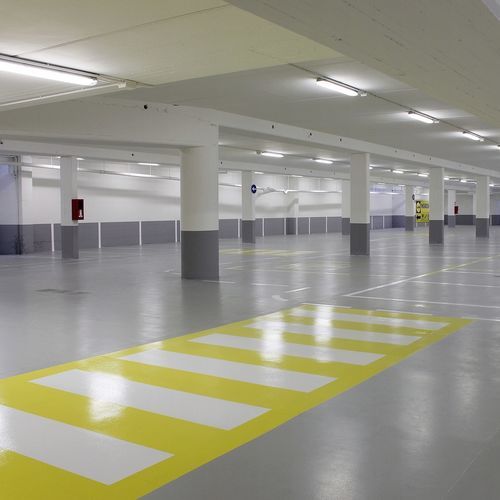
- In facilities with different functional areas or safety zones, consider color-coding the resin floors to aid in organization and safety. For example, mark pedestrian walkways in a contrasting colour to alert employees to designated paths.
4. Balance aesthetics and practicality:
- While aesthetics are important, practicality should also be a primary consideration. Choose a colour that complements the overall design of the facility while meeting functional requirements.
5. Promote employee well-being and productivity:
- Consider the impact of colour on employee well-being and productivity. Certain colours can evoke different emotions and moods. For example, light blue or green can create a calming effect, while bright yellow can enhance energy and alertness.
6. Assess visibility and contrast:
- Ensure that the chosen floor colour provides sufficient contrast with other elements in the environment, such as equipment, walls, and safety signage. High visibility helps prevent accidents and improves overall safety.
7. Obtain samples and conduct tests:
- Request resin floor colour samples from suppliers and test them in the actual industrial environment. Evaluate how the colours appear under different lighting conditions and assess their visibility and practicality.
8. Involve employees and stakeholders:
- Seek input from employees and other stakeholders, such as facility managers and safety personnel. Their perspectives and insights can provide valuable input for selecting the most suitable resin floor colour.
9. Prioritize functionality and safety:
- Ultimately, prioritize functionality and safety over aesthetics when choosing the resin floor colour. While aesthetics are essential, the primary goal is to ensure the floor meets the operational needs and enhances safety in the industrial environment.
By following this practical guide, companies can select the most appropriate resin floor colour that not only enhances the aesthetics of the industrial environment but also improves visibility, promotes employee well-being, and ensures safety and efficiency in the workplace.


