#Industry News
Blue Rugs
Material Intelligence and Spatial Depth
The role of color in space
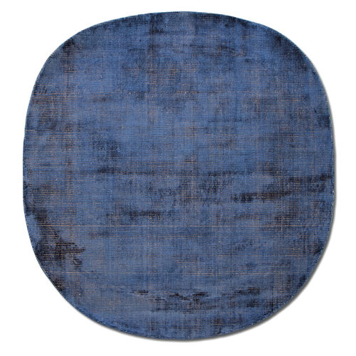
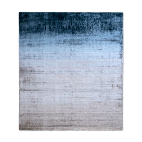
Blue introduces a spatial paradox: applied to a surface, a rug doesn't merely cover it, but suggests depth, visually extending the space. Blue expresses itself in different registers depending on context: a blue-gray converses with stone and concrete, a blue-green recalls the patina of copper, an indigo preserves the memory of vegetable dyes. Each variation carries its own atmospheric weight and a different approach to the chromatic grounding of a room.
Choosing the right shade for each space
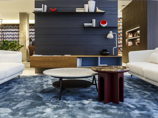
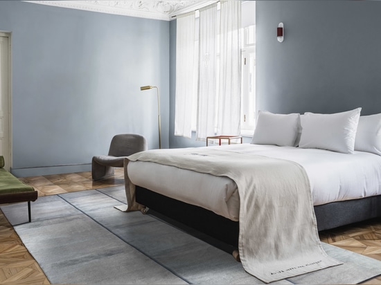
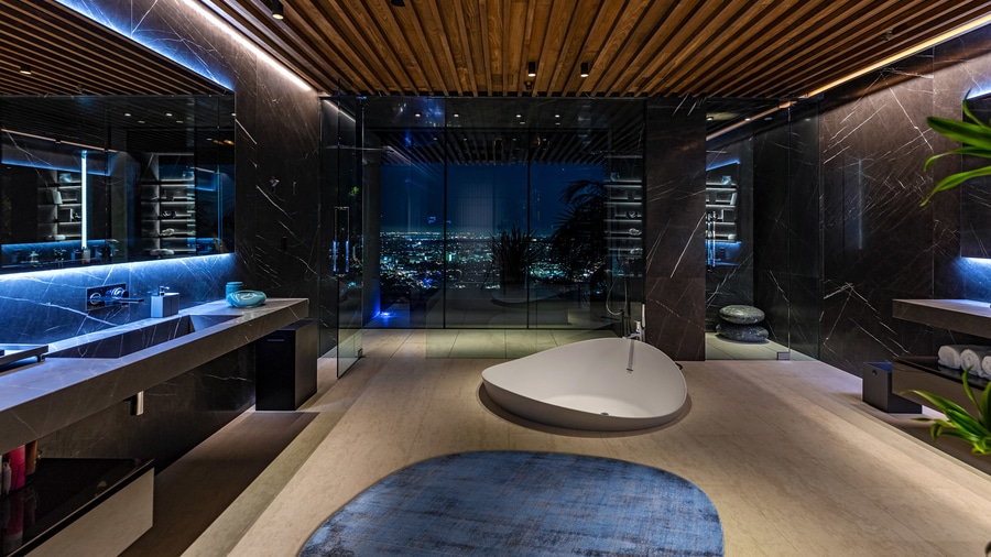
The choice of a rug's color cannot be separated from the characteristics of the space. Navy and deep indigo anchor living areas with high ceilings and abundant natural light, while in north-facing rooms blue-gray tones maintain brightness without feeling cold. Paler tones, closer to neutrals, instead create a calm atmosphere suited to bedrooms and smaller spaces, expanding the perceived space. In open-plan projects, medium-saturation blues function as a tool for chromatic zoning, defining areas without resorting to physical barriers.
Navy or light blue: two opposite effects
A navy blue rug conveys stability and functions almost like a neutral, anchoring the furnishings without becoming the room's protagonist: it's the ideal choice for interiors where sobriety and material presence are dominant values. A light blue rug, by contrast, expands the perception of space and creates a more relaxed atmosphere, making it ideal for small rooms or settings where lightness is favored over spatial definition.
The materiality of color
Textile blue carries with it the history of the techniques that made it possible: natural indigo derives from a controlled bacterial fermentation capable of transforming the leaf into dye, while Prussian blue, which appeared in the eighteenth century, introduced synthetic chemistry, radically changing the economics of color. The type of blue available to a weaver still defines its appearance today, its durability over time, and the way it bonds with different fibers.
Wool, linen, and silk retain blue with varying intensity, and in hand-woven rugs this unevenness remains visible. Far from being a flaw, this variation tells the story of the material's authenticity.
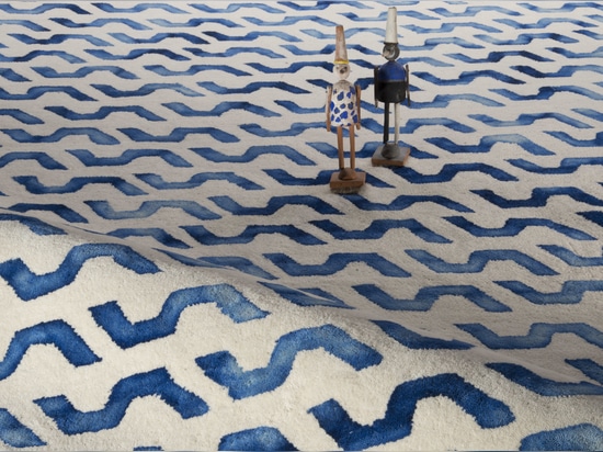
It's within this space that G.T.DESIGN's indigo collection moves, where color doesn't reach maximum saturation immediately but builds up through successive dye baths on natural wool or linen. The result is a depth achieved through layering: a chromatic complexity that reveals itself bath after bath.
Spatial perception and color pairings
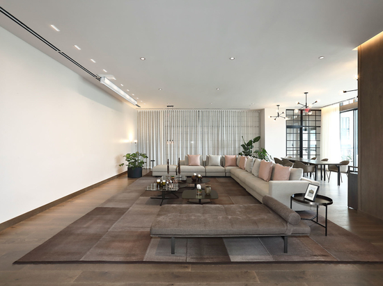
In cool tones, blue recedes, visually opening the space outward, while in palettes leaning toward monochrome it acts as a silent counterweight, introducing depth without disturbing the overall sobriety. In open-plan spaces, in particular, a blue rug can demarcate zones through color variation alone, preserving visual continuity. Among the most effective pairings:
- Gray walls and furnishings: tonal continuity is reinforced between cool grays and blue, while a navy on warm gray introduces a measured contrast.
- White interiors: navy offers a bold contrast, indigo introduces warmth, avoiding a clinical effect, while natural wood balances the coolness of the color.
- Natural materials: paired with wood, stone, and raw plaster, blue accentuates the depth of oak and walnut, while stone tempers its intensity, in a dynamic balance between color and material.
Durability and transformation over time
The lasting quality of blue depends on the chemistry and structure of the yarn: natural indigo fixes through oxidation, while synthetic blues show highly variable resistance to light. A rug that fades isn't necessarily in decline, since in some contexts this transformation makes visible the time lived within the space. The vegetable indigo used by G.T.DESIGN, in particular, tends to intensify with exposure rather than deteriorate, developing character over time.
Weave structure and light behavior
A rug's construction affects color perception: a tight weave produces a uniform, almost painterly surface; a more open weave lets light filter through, creating shadows and tonal variations; while in high-pile rugs, light is held within the fiber, generating a visual softness that changes with the angle of view. This relationship between textile structure and lighting conditions is part of the research that accompanies the contemporary development of the rug.
A color that builds atmosphere
Blue carries perceptual associations difficult to separate from the color itself (water, sky, distance, freshness) that a rug can soften or accentuate depending on its own color temperature. Choosing a blue rug therefore means engaging with the perception of space and with time: a textile that doesn't simply cover the floor, but modulates light, defines boundaries, and builds atmosphere, at the point where material intelligence and spatial awareness meet.